What Makes a Poster Actually Stop Someone Scrolling
A poster has half a second to earn attention. Here's what makes people stop scrolling.
Insights

1. One Idea, Not Five
The posters that stop scrolls never try to say everything. They say one thing, loudly, and trust the rest of the message to follow. Clarity isn't the boring choice, it's the brave one.

2. Contrast Isn't Optional, It's the Whole Job
Color against color, big against small, silence against noise — a poster survives on tension. Without contrast, even the best idea disappears into the feed's wallpaper of sameness.
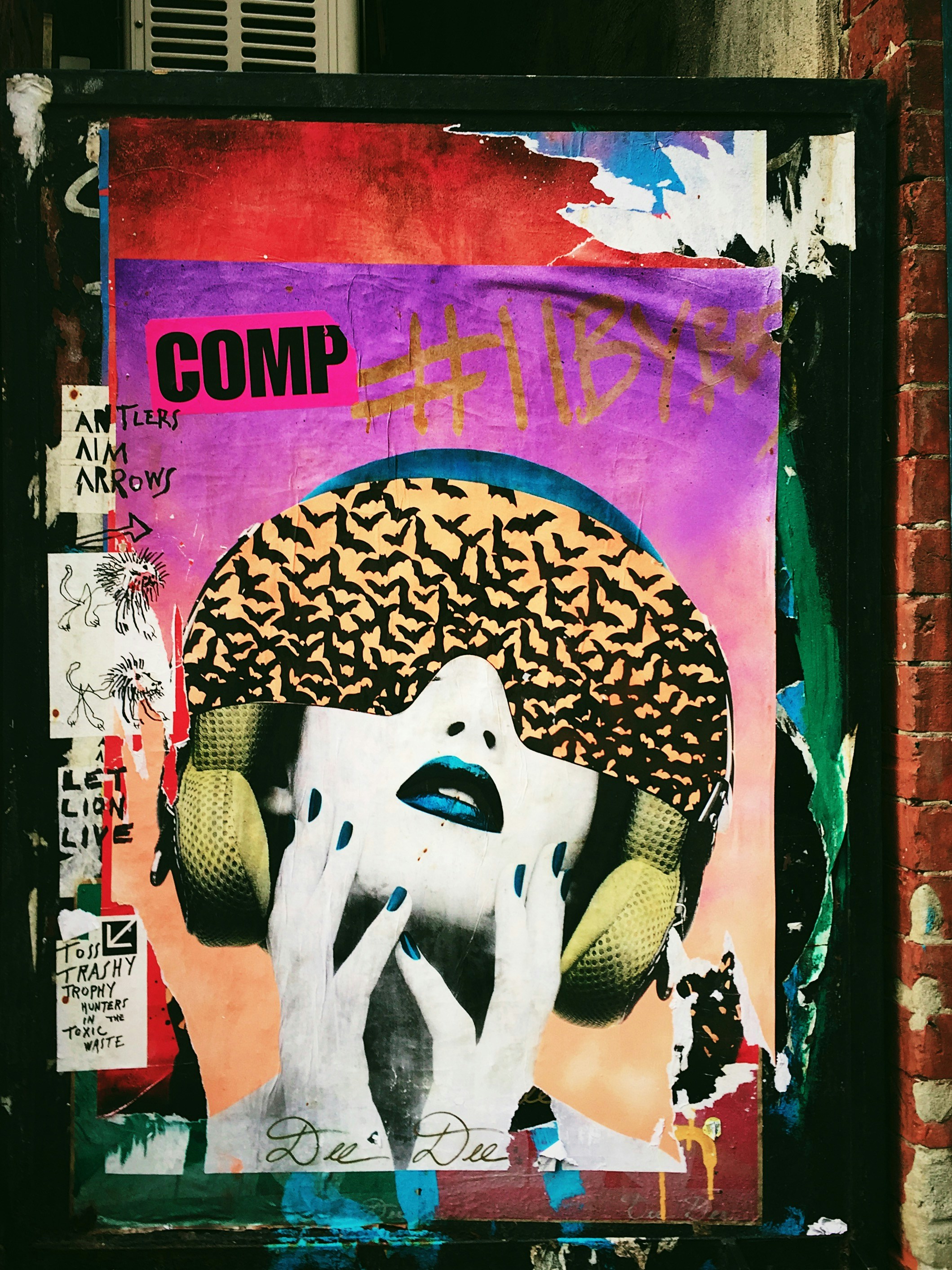
3. Typography That Behaves Like a Voice, Not a Label
The best type doesn't just display words — it performs them. A scream looks different from a whisper. If your headline could be read in any font and lose nothing, it hasn't been designed yet — it's been typed.
4. Negative Space Is Doing More Work Than You Think
What's left out is often louder than what's put in. Empty space gives the eye somewhere to land before it's asked to think.


4. It Should Feel Like a Decision, Not a Compromise
Scroll-stopping work rarely looks safe. It looks like someone made a choice and committed to it, no hedging, no "let's please everyone" softness.

More to Discover
What Makes a Poster Actually Stop Someone Scrolling
A poster has half a second to earn attention. Here's what makes people stop scrolling.
Insights
1. One Idea, Not Five
The posters that stop scrolls never try to say everything. They say one thing, loudly, and trust the rest of the message to follow. Clarity isn't the boring choice, it's the brave one.
2. Contrast Isn't Optional, It's the Whole Job
Color against color, big against small, silence against noise — a poster survives on tension. Without contrast, even the best idea disappears into the feed's wallpaper of sameness.
3. Typography That Behaves Like a Voice, Not a Label
The best type doesn't just display words — it performs them. A scream looks different from a whisper. If your headline could be read in any font and lose nothing, it hasn't been designed yet — it's been typed.
4. Negative Space Is Doing More Work Than You Think
What's left out is often louder than what's put in. Empty space gives the eye somewhere to land before it's asked to think.
4. It Should Feel Like a Decision, Not a Compromise
Scroll-stopping work rarely looks safe. It looks like someone made a choice and committed to it, no hedging, no "let's please everyone" softness.
More to Discover
What Makes a Poster Actually Stop Someone Scrolling
A poster has half a second to earn attention. Here's what makes people stop scrolling.
Insights
1. One Idea, Not Five
The posters that stop scrolls never try to say everything. They say one thing, loudly, and trust the rest of the message to follow. Clarity isn't the boring choice, it's the brave one.
2. Contrast Isn't Optional, It's the Whole Job
Color against color, big against small, silence against noise — a poster survives on tension. Without contrast, even the best idea disappears into the feed's wallpaper of sameness.
3. Typography That Behaves Like a Voice, Not a Label
The best type doesn't just display words — it performs them. A scream looks different from a whisper. If your headline could be read in any font and lose nothing, it hasn't been designed yet — it's been typed.
4. Negative Space Is Doing More Work Than You Think
What's left out is often louder than what's put in. Empty space gives the eye somewhere to land before it's asked to think.
4. It Should Feel Like a Decision, Not a Compromise
Scroll-stopping work rarely looks safe. It looks like someone made a choice and committed to it, no hedging, no "let's please everyone" softness.